
玉玦图

玉玦图的简介
玦[jué]:半环形有缺口的佩玉,古代常用以赠人表示决绝。
玉玦图(又名,环形柱状图),是柱状图关于笛卡尔坐标系转换到极坐标系的仿射变换。其意义和用法与柱状图类似。
玉玦图有半价反馈效应。由于玉玦图中是用角度表示每个玦环数值的大小,角度是决定性因素。所以,哪怕外侧(半径大的)玦环的数值小于内侧(半径小的)玦环,外侧的每个玦环会相对的比里面的玦环更长。这会造成视觉上的误解。
而且因为我们的视觉系统更善于比较直线,所以笛卡尔坐标系更适合于比较各个分类的数值比较。所以玉玦图从实用的角度去看,其更多的是一种审美上的需求。
英文名:Radial bar chart
玉玦图的构成
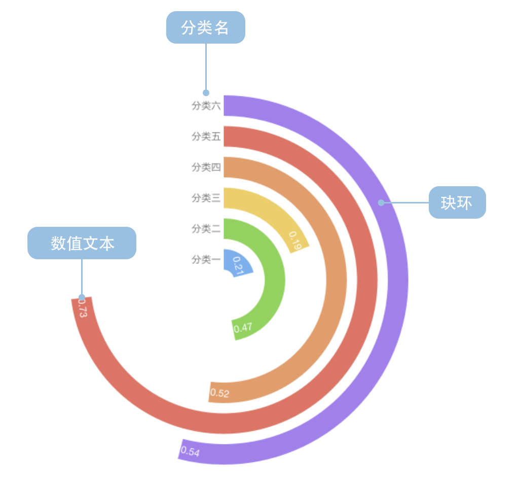
一个完整的玉玦图包含以下构成元素:
- 玦环:角度表示数值
- 文本:数值、分类名
玉玦图的应用场景
适合的场景
例子1: 下图反应了美国民众对不同领域中的中美问题关注程度。
| 问题 | 关注人数比例 |
|---|---|
| 台海关系 | 0.21 |
| 中国持续增长的军事力量 | 0.47 |
| 中国对全球环境的影响 | 0.49 |
| …… | …… |
| 中国持有美国巨额国债 | 0.67 |
var data = [
{question: '台海关系',percent: 0.21, odd: 0},
{question: '中国持续增长的军事力量',percent: 0.47, odd: 1},
{question: '中国对全球环境的影响',percent: 0.49, odd: 0},
{question: '美国对中国的贸易逆差',percent: 0.52, odd: 1},
{question: '中国的人权政策',percent: 0.53, odd: 0},
{question: '来自中国的网络攻击',percent: 0.54, odd: 1},
{question: '中国带走了美国的就业岗位',percent: 0.60, odd: 0},
{question: '中国持有美国巨额国债',percent: 0.67, odd: 1}
];
var Stat = G2.Stat;
var Frame = G2.Frame;
var frame = new Frame(data); // 加工数据
var chart = new G2.Chart({
id: 'c1',
forceFit: true,
height: 500
});
chart.source(frame);
chart.col('odd',{
type: 'cat',
values: ['奇数','偶数']
});
chart.coord('polar',{inner: 0.1}).transpose();
chart.col('percent',{min: 0,max: 1});
chart.interval().position('question*percent')
.color('odd',['rgb(211,0,57)','rgb(224,74,116)'])
.label('percent',{offset: -1, label: {fontWeight: 'bold'}});
frame.each(function(obj){
chart.guide().text([obj.question,0],obj.question + ' ',{
'text-anchor' : 'end'
});
});
chart.render();
例子2: 下图反应了各国人民认为气候变化是严重问题的比例。
| 国家 | 关注人数比例 |
|---|---|
| 巴西 | 0.86 |
| 印度 | 0.76 |
| 智利 | 0.76 |
| …… | …… |
| 中国 | 0.18 |
var data = [
{country:'巴西', percent:0.86},
{country:'印度', percent:0.76,},
{country:'智利', percent:0.76,},
{country:'乌干达', percent:0.76,},
{country:'菲律宾', percent:0.72,},
{country:'越南', percent:0.69,},
{country:'法国', percent:0.56,},
{country:'德国', percent:0.55,},
{country:'加拿大', percent:0.51,},
{country:'韩国', percent:0.48,},
{country:'美国', percent:0.45,},
{country:'日本', percent:0.45,},
{country:'澳大利亚', percent:0.43,},
{country:'英国', percent:0.41,},
{country:'俄罗斯', percent:0.33,},
{country:'中国', percent:0.18,},
{country:'平均', percent:0.54,}
];
data.sort(function(o1,o2){
return o1.percent - o2.percent;
});
var Stat = G2.Stat;
var Frame = G2.Frame;
var frame = new Frame(data); // 加工数据
frame.addCol('condition', function(obj){
if (obj.country === '中国'){
return 1;
} else if(obj.country === '平均'){
return 2;
} else {
return 0;
}
});
var chart = new G2.Chart({
id: 'c1.1',
forceFit: true,
height: 500,
plotCfg: {margin: [0,0,40,0]}
});
chart.source(frame);
chart.coord('polar',{
inner: 0.1,
startAngle: -1 * Math.PI,
endAngle: -0.25 * Math.PI
}).transpose();
chart.col('condition',{
type: 'cat',
values: ['一般','特殊','平均']
});
chart.intervalStack()
.position("country*percent")
.color('condition',['#2370AE','#A34265','#505051'])
.label('percent').size(20);
frame.each(function(obj){
chart.guide().text([obj.country,0],obj.country + ' ',{
'text-anchor' : 'start',
'rotate': 90
});
});
chart.render();
玉玦图的误用场景
简介中提到玉玦图具有半径反馈效应。视觉上半径越大的玦环会看起来更大,半径小的则小。造成玉玦图的误用(见左图)。所以,我们认为玉玦图使用时必须进行排序(见右图)。
错误
正确
var data = [
{country:'巴西', percent:0.86},
{country:'印度', percent:0.76,},
{country:'智利', percent:0.76,},
{country:'乌干达', percent:0.76,},
{country:'菲律宾', percent:0.72,},
{country:'越南', percent:0.69,},
{country:'法国', percent:0.56,},
{country:'德国', percent:0.55,},
{country:'加拿大', percent:0.51,},
{country:'韩国', percent:0.48,},
{country:'美国', percent:0.45,},
{country:'日本', percent:0.45,},
{country:'澳大利亚', percent:0.43,},
{country:'英国', percent:0.41,},
{country:'俄罗斯', percent:0.33,},
{country:'中国', percent:0.18,},
{country:'平均', percent:0.54,}
];
var Stat = G2.Stat;
var Frame = G2.Frame;
var frame = new Frame(data); // 加工数据
frame.addCol('condition', function(obj){
if (obj.country === '中国'){
return 1;
} else if(obj.country === '平均'){
return 2;
} else {
return 0;
}
});
var chart = new G2.Chart({
id: 'c2',
width:400,
height: 420,
plotCfg: {margin: [0]}
});
chart.coord('polar',{
inner: 0.1,
startAngle: -1 * Math.PI,
endAngle: -0.25 * Math.PI
}).transpose();
chart.col('condition',{
type: 'cat',
values: ['一般','特殊','平均']
});
chart.source(frame);
chart.intervalStack()
.position("country*percent")
.color('condition',['#2370AE','#A34265','#505051'])
.label('percent').size(8);
frame.each(function(obj){
chart.guide().text([obj.country,0],obj.country + ' ',{
'text-anchor' : 'start',
'rotate': 90
});
});
chart.render();
var data = [
{country:'巴西', percent:0.86},
{country:'印度', percent:0.76,},
{country:'智利', percent:0.76,},
{country:'乌干达', percent:0.76,},
{country:'菲律宾', percent:0.72,},
{country:'越南', percent:0.69,},
{country:'法国', percent:0.56,},
{country:'德国', percent:0.55,},
{country:'加拿大', percent:0.51,},
{country:'韩国', percent:0.48,},
{country:'美国', percent:0.45,},
{country:'日本', percent:0.45,},
{country:'澳大利亚', percent:0.43,},
{country:'英国', percent:0.41,},
{country:'俄罗斯', percent:0.33,},
{country:'中国', percent:0.18,},
{country:'平均', percent:0.54,}
];
data.sort(function(o1,o2){
return o1.percent - o2.percent;
});
var Stat = G2.Stat;
var Frame = G2.Frame;
var frame = new Frame(data); // 加工数据
frame.addCol('condition', function(obj){
if (obj.country === '中国'){
return 1;
} else if(obj.country === '平均'){
return 2;
} else {
return 0;
}
});
var chart = new G2.Chart({
id: 'c3',
width:400,
height: 420,
plotCfg: {margin: 0}
});
chart.coord('polar',{
inner: 0.1,
startAngle: -1 * Math.PI,
endAngle: -0.25 * Math.PI
}).transpose();
chart.col('condition',{
type: 'cat',
values: ['一般','特殊','平均']
});
chart.source(frame);
chart.intervalStack()
.position("country*percent")
.color('condition',['#2370AE','#A34265','#505051'])
.label('percent').size(8);
frame.each(function(obj){
chart.guide().text([obj.country,0],obj.country + ' ',{
'text-anchor' : 'start',
'rotate': 90
});
});
chart.render();