
G2
- 快速上手
-
- 基础教程
- G2 图表的主要组成
- 图表对象配置(chart)
- data 数据
- Frame 常见操作
- 度量
- 列定义操作
- geom 几何标记
- attr 图形属性
- coord 坐标系
- axis 坐标轴
- legend 图例
- tooltip 提示信息
- guide 辅助标记
- stat 统计变换
- facet 分面
- theme 图表样式
- label 文本标签
- 图表事件 event
- 图表交互
- 数据异步加载与动态更新
- 数据滑动条插件使用
- 在 react 中使用 G2
- 常见问题
- 高级教程
- G2 图形语法简介
- G2 的数据处理流程
- 数据类型与度量
- 坐标系详解
- 图表类型
- 几何标记和数据调整
- 自定义 shape
- 多视图 view 绘制
- layout 布局
- 使用 G2 绘制词云
- 自定义动画
- 图表示例
-
- 更新日志
简介
在图表样式上,G2 提供了丰富的自定义配置选项,即可从全局设置,也支持局部设置数据层级的设置。
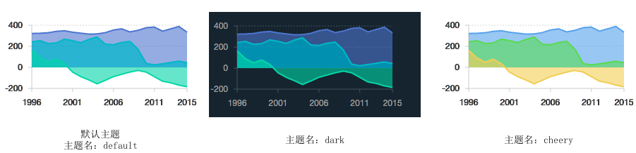
图表主题
G2 默认提供了三种图表主题: default、dark、cheery。
图表样式设置
图表主题切换
(1)方式一: 直接传入主题名
var Global = G2.Global; // 获取 Global 全局对象
Global.setTheme('dark'); // 传入值为 'default'、'dark'、'cheery'的一种,如果不是,那么使用 default 主题。
(2)方式二: 传入 G2.Theme 对象
var Global = G2.Global; // 获取 Global 全局对象
var Theme = G2.Theme; // 获取 Theme 对象,包含三个属性: 'default' 'dark' 'cheery' 对应主题名
Global.setTheme(Theme['cheery']); // 传入值为 'default'、'dark'、'cheery'的一种,如果不是,那么使用 default 主题。
局部样式设置
G2 图表样式的配置项都是设置到全局变量 G2.Global 上,可以通过如下两种方式进行局部的样式设置:
(1)方式一: 直接赋值给全局对象 Global,但是不推荐
G2.Global.animate = false ; // 关闭默认动画
G2.Global.colors['default'] = ['red','blue','yellow']; // 更改默认的颜色
(2) 方式二: 使用 Global.setTheme 方法。推荐使用这种方式,使用方法如下:
var theme = G2.Util.mix(true, {}, G2.Theme, {
  animate: false,
  colors: {...},
  shapes: {...}
  // 具体的配置项详见 api/global.html
});

G2.Global.setTheme(theme); // 将主题设置为用户自定义的主题
对于数据级别或者更细粒度的样式设置,可以通过 color 图形属性或者各个 chart 配置项上的图形属性设置。
更多 Global 上关于主题的配置属性,请查看 Global API。
示例
var theme = G2.Util.mix(true, {}, G2.Theme, {
  shape: {
    polygon: {
      stroke: '#213c51', // 地图轮廓线颜色
      lineWidth: 1 // 地图轮廓线宽度
    },
    hollowPoint: {
      fill: '#21273b', // 点的填充颜色
      lineWidth: 2, // 点的边框宽度
      radius: 3 // 点的半径
    },
    interval: {
      fillOpacity: 1 // 填充透明度设置
    }
  },
  axis: {
    bottom: {
      labels: {
        label: { fill: '#999'} // 底部标签文本的颜色
      }
    },
    left: {
      labels: {
        label: { fill: '#999'} // 左部标签文本的颜色
      }
    },
    right: {
      labels: {
        label: { fill: '#999'} // 右部标签文本的颜色
      }
    }
  }
});
G2.Global.setTheme(theme);

$.getJSON('../../../../../static/data/china.json', function(mapData) {
  var Stat = G2.Stat;
  var userData = [];
  var features = mapData.features;
  for(var i=0; i<features.length; i++) {
    var name = features[i].properties.name;
    userData.push({
      "name": name,
      "value": Math.round(Math.random()*1000)
    });
  }
  var chart = new G2.Chart({
    id: 'c1',
    width: 600,
    height: 320,
    plotCfg: {
      margin: [20, 80, 0, 80]
    }
  });
  chart.source(userData);
  chart.tooltip({
    title: null,
    map: {
      name: "name",
      value: "value"
    }
  });
  chart.legend(false);
  chart.polygon().position(Stat.map.region('name', mapData)).color('value','#39ccf4-#20546b').style({
    lineWidth: 1,
    stroke: '#999'
  });
  chart.render();

  var data = [
    {'time': '10:10', 'call': 4, 'waiting': 2, 'people': 2},
    {'time': '10:15', 'call': 2, 'waiting': 6, 'people': 3},
    {'time': '10:20', 'call': 13, 'waiting': 2, 'people': 5},
    {'time': '10:25', 'call': 9, 'waiting': 9, 'people': 1},
    {'time': '10:30', 'call': 5, 'waiting': 2, 'people': 3},
    {'time': '10:35', 'call': 8, 'waiting': 2, 'people': 1},
    {'time': '10:40', 'call': 13, 'waiting': 1, 'people': 2}
  ];
  var Frame = G2.Frame;
  var frame = new Frame(data);
  frame = Frame.combinColumns(frame,['call','waiting'],'count','type',['time', 'people']);
  var chart2 = new G2.Chart({
    id: 'c2',
    width: 600,
    height: 250
  });
  chart2.source(frame, {
    'count': {alias: '话务量(通)', min: 0},
    'people': {alias: '人数(人)', min: 0}
  });
  chart2.axis('time', {
    title: null // 去除 X 轴标题
  });
  chart2.legend(false);// 不显示图例
  chart2.intervalStack().position('time*count').color('type', ['#348cd1', '#43b5d8']); // 绘制层叠柱状图
  chart2.line().position('time*people').color('#5ed470').size(4).shape('smooth'); // 绘制曲线图
  chart2.point().position('time*people').color('#5ed470'); // 绘制点图
  chart2.render();
});